Mission.
Design a site that provides transparency between the police & the public in order to bring better overall interactions together.
Who & When?
2 UX/UI Designers, 4 Web developers, and in 3 weeks!
How Did We Do It?
With a well thought out design process of course!
*framework made with love in Sketch
INVESTIGATE.
This is the phase where we collect data and start to learn as much as we can!
Competitive Analysis.
Rate My Professor: Highest rated professor gives inspiration to add highest rated officer module for positivity.
Glassdoor: Provides inspiration for our feedback and rating module.
Yelp: Search function and rating inspiration
The Torn Up Citation Analysis.
We were able to get our hands on a real live citation (don’t ask)! We observed that the Officers name and badge# is listed. *Valuable info for future search criteria
Focus Group Q & A.
We led a group of 10 in what started out as abstract questioning based on how they felt about police officers and what animal they associated with them.
Our Survey Says…
We asked over 120 people and they responded.
*Survey made in google Surveys
DESIGNATE.
In this phase we define our users and features based on our previous research and data.
Meet our User Personas.
Feature Ideation Session.
We got together with the developers and did some feature brainstorming while we employed the Hyper Island methodology. How might we…
User Journey.
We followed Ryan’s feedback journey through the best and the worst of times.
MVP Session.
Our Minimum Viable Product was narrowed down together with the developers while we employed the Moscow Method. We agreed on our must haves, could haves, would haves and hesitantly shelved our won’t haves.
Site Map.
This is our design blueprint and shows the developers what to build. Our goal was to keep it as minimal as possible.
IDEATE.
This is where we start conceptualizing and digging into design!!!
Paper Sketches & 1:1 Feedback.
After extensive workshops and creating the site map we were able to start sketching screens in order to get immediate feedback in our 1 on 1 sessions. Lean UX says this is the best practice to save time and money!
*made old school with sharpie & paper
Wireframes.
After doing many variations of wireframes and receiving feedback, we took what worked best and made a more robust fully scrollable homepage concept.
User Testing
We relied on 10 testers to create our home page hierarchy for us. Literally did all the work for me!
EVALUATE.
In this phase we gain more feedback by testing mockups and prototypes and continuing to iterate.
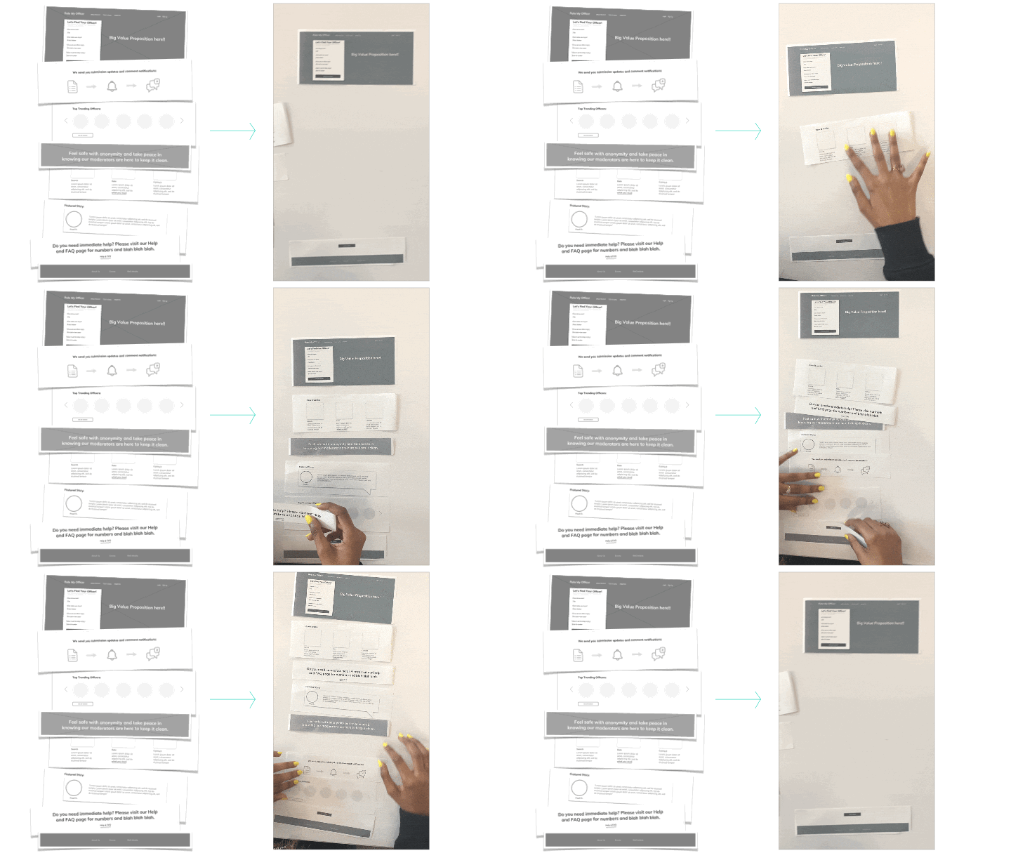
Anatomy of the Homepage.
User feedback becomes the building blocks for the home page. Here’s why.
*All wireframes made with love in Sketch App
IXD.
A little bit of interaction design goes a long way!
Persistant Nav.
It is important that the user always has a clear call to action on the homepage. As the hero’s CTA slides out of view, the Navigation transitions from dark to light and features a fresh Rate your Officer button!
Officer Avatar Hover.
Our original idea of having a carousel didn’t fair well in user feedback. So in order to ensure engagement for this module we added a hover interaction!
*All IXD shown above made in Keynote
Mood Board.
I took inspiration from classic colors associated with police uniforms and cars. I chose an accent shade of turquoise as color theory suggest this provides comfort and a sense of unity.
Color & Hero Studies.
Different colors and images evoke different sorts of feelings for people. There were many that I thought looked good but made others feel uncomfortable. Feedback in this area was essential.
“The hands on top of the cop car feel too serious and kinda scares me”
-Tester 1
“All of the bright lights and rainbow colors feel too Miami dance clubby”
- Tester 2
Prototyping.
By prototyping our higher fidelity mockups we are able to test the UI and better understand how users interact with the site. Check out my full clickable prototype in Invision here
Home Page Flow.
Home page gives the user all of the information they need in small digestible doses with clear CTA’s on hand at all times.
Officer Search Flow.
Followed Luke W.’s forms & best practices. Thankfully we got a hold of that torn up citation so we had a good grasp on what we needed for search criteria. *Search layout cred goes to Airbnb!
Search Results > Officer Profile.
If a user doesn’t receive a citation they can begin their search by entering as many details as possible and can filter by sex, alphabet, or rating. When the officer is found they can view their profile page along with past reviews and ratings.
Rate Your Officer!
Considering many of our users may be reporting traumatic experiences, it was essential to make the rating flow as simple, clear, and as fast as possible. The back button and logo allow for user control to opt out and the progress bar lets them know where they are at!
Check Out These Stills!
COMMUNICATE.
This is where we work with developers to realize our designs. Good communication and well thought out systems are key.
DSM.
Design Systems Management translates to other designers and to developers exact colors , buttons and font sizes.
*Made in Invision, Cloud App, & Keynote
Inspect.
This amazing tool gives developers exact dimensions, color sizes of every element on every page! TY Invision!
Developer Hand Off.
Our google doc linked to all design items are handed off to our dev team in the most simple and efficient manner possible. We meet one last time to ensure everything is needed on our side to get our product built to spec!
Designed in March 2020


